
“Freshness in every sip, goodness in every bite” — Fruitlet needed a store that could sell a same-day, handcrafted product online without losing that fresh-cut feeling.
About the Brand
Fruitlet is a premium fruit beverage and gourmet fruit bowl brand built on one idea: nature already makes the best flavours, so why interfere with them. Every juice, shake, smoothie, and fruit bowl is crafted fresh from carefully selected, export-quality fruit — no preservatives, no artificial flavours, no shortcuts.
The brand spans six focus categories — Premium Shakes, Fresh Juices, Signature/Fruit Carnival, Gourmet Fruit Bowls, Salads, and Sliced Fruits — which meant the website had to sell very different products (a chocolate shake and a watermelon-feta salad don’t share a shelf) under one coherent, appetite-driving identity.
The Challenge
Selling fresh-cut fruit and made-to-order shakes online is a different game from selling packaged goods. A buyer can’t taste freshness through a screen, the product range covers genuinely different categories that don’t naturally sit together, and because it’s a same-day, often impulse order, the path from “I want a shake” to “order placed” has to be short.
- Make “freshly prepared, same day” trust feel real online, not just a tagline in the hero banner
- Present six distinct categories — shakes, juices, fruit carnival, gourmet bowls, salads, sliced fruit — without the catalogue feeling scattered
- Keep ordering fast and frictionless for a product people often decide on quickly
- Surface bestsellers and deals to guide buyers who are browsing, not searching for something specific
- Build a catalogue structure that scales cleanly as new seasonal shakes and bowls get added
Our Approach
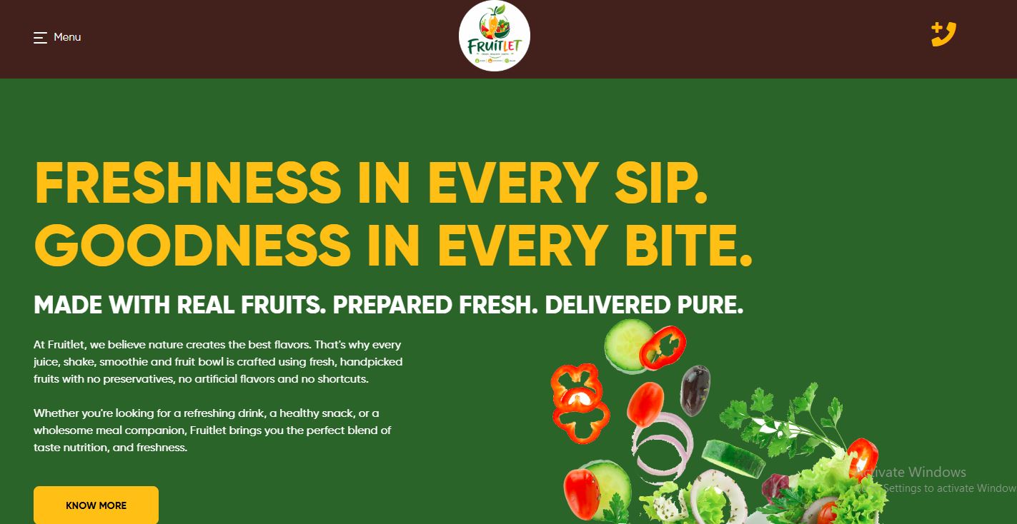
We built the homepage to sell freshness on sight — bright, appetite-driving colours, real product photography, and the brand’s own promise (“made with real fruits, prepared fresh, delivered pure”) given room to breathe instead of being buried under navigation. A 24/7 quick-order number sits front and centre, because for a product like this, picking up the phone or tapping “Order Now” is often faster than a full checkout flow — and the site was built to support both.
For the catalogue, we split the six categories into their own clearly filterable sections, with a sidebar and search bar so a buyer looking specifically for mango slices isn’t forced to scroll past salads and shakes to find them. Bestselling shakes and a “Best Deals” panel were placed early, giving undecided buyers a fast, low-effort way to choose.
Key Features Delivered
1. Fresh-First Homepage Storytelling
A vibrant hero section leading with the brand’s freshness promise and real product photography, so quality is felt before a single product is clicked.
2. Category-Rich Catalogue Structure
Shakes, Juices, Signature/Fruit Carnival, Gourmet Fruit Bowls, Salads, and Sliced Fruits each get their own clearly filterable section.
3. Click-to-Call Quick Ordering
A 24/7 quick-order number placed prominently on every page, matching how customers actually order fresh food — by phone as often as by cart.
4. Bestseller & Deals Highlighting
“Best-Selling Shakes” and a “Best Deals” sidebar guide browsing customers toward popular picks instead of leaving them to scroll a full catalogue.
5. Product-Photography-Led Cards
Every item — from papaya cubes to a tropical mango salad — is shown with clean, appetising photography, since taste can’t be sold through text alone.
6. Scalable Filter & Search System
Category sidebar plus a dedicated search bar, built to stay easy to browse as the catalogue grows well past its current 30-plus items.
Technology Stack
A stack chosen for a food brand with a growing, frequently updated catalogue — one the Fruitlet team can manage day-to-day without needing a developer for every new seasonal item.
- WooCommerce / WordPress — flexible product catalogue, categories, and cart
- Custom theme development — matched to Fruitlet’s fresh green-and-yellow visual identity
- Category & filter architecture — six product categories, sortable and searchable
- Click-to-call integration — for fast, phone-first ordering
- Image optimisation — fast-loading, appetite-driving food photography
- Responsive, mobile-first design
- SEO fundamentals — structured metadata and clean, category-based URLs
The Result
Fruitlet now has a store that sells the way the brand actually operates — fresh, fast, and built around real fruit, not a generic product grid. Buyers can browse by category, spot a bestseller in seconds, or simply call in an order, all within the same fresh, unmistakably Fruitlet experience.
- ✓ A homepage that sells freshness before a single product is clicked
- ✓ A six-category catalogue that stays easy to browse past 30+ products
- ✓ Frictionless, phone-first ordering suited to a same-day product
- ✓ Bestseller and deals sections that guide quick purchase decisions
- ✓ Consistent, appetite-driving photography across every product card
- ✓ A scalable structure ready for new seasonal shakes, juices, and bowls
Conclusion
A brand built on fresh, real fruit needed a website that didn’t feel like a warehouse catalogue — it needed to feel like walking up to the counter. By leading with freshness, organising a wide range into clear categories, and keeping ordering as fast as the product itself, we helped Fruitlet bring its “freshness in every sip, goodness in every bite” promise online, without losing what makes the brand work in the first place.